Case Study 8 – Harmony & Balance — Designing Calm for a Crowded Shelf
Harmony & Balance—designing calm for a crowded shelf.
A durable, product-first packaging system that translates the space, control, and intentional movement of yoga into a distinctive retail presence.
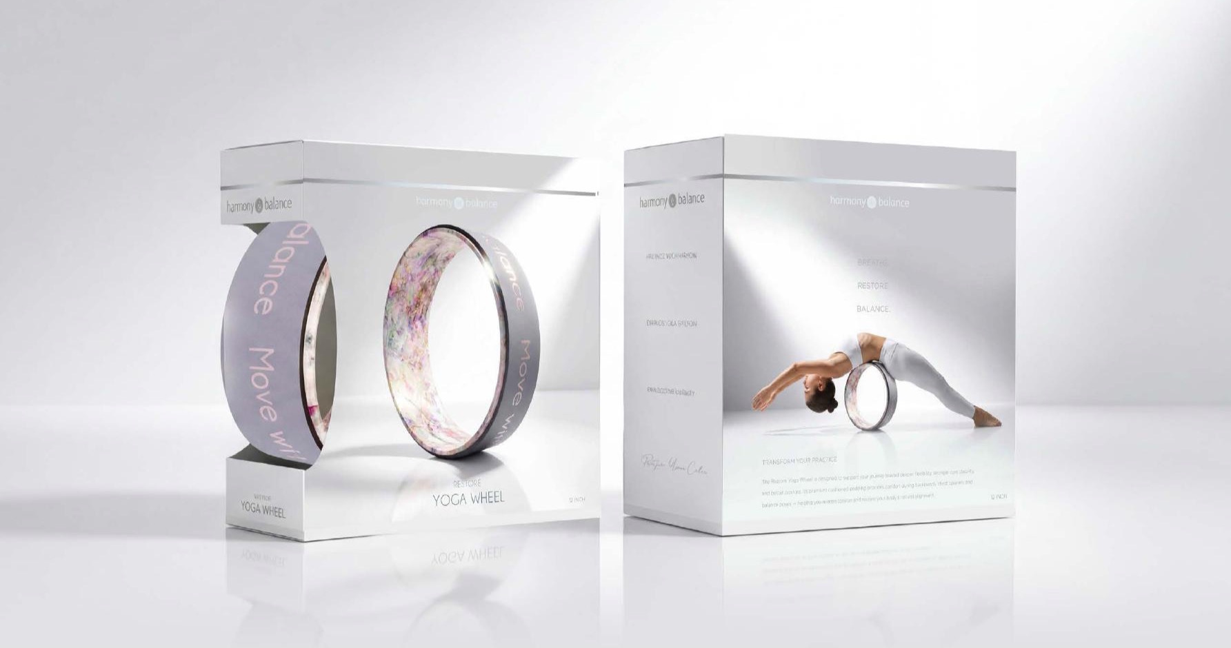
Finding distinction in a category of sameness.
Yoga accessories at mass retail had begun to converge around the same dominant visual language. Established brands—and the competitors following them—were creating a shelf where products felt increasingly interchangeable.
Harmony & Balance needed a recognizable point of view that could compete in retailers such as Walmart and TJ Maxx without becoming louder or more crowded. The opportunity was to make calm itself the differentiator.
Use space as a design element. Let the product, the pose, and the packaging breathe.
The visual behavior of yoga, translated into packaging.
Product first
Generous windows reveal distinctive color, pattern, texture, and embossed details—turning the product itself into a brand asset.
Breath and space
Soft whites, mineral greys, controlled shadows, and restrained typography create serenity without sacrificing retail clarity.
Movement as language
Purposeful yoga poses demonstrate product use while building a consistent emotional and functional story.
Built for shelf
Durability, window placement, hangability, protection, and legibility informed every structural decision.
One calm system. Many forms of interaction.
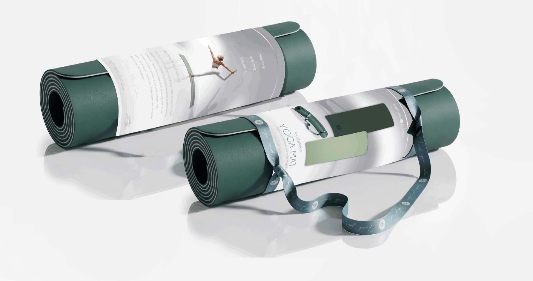
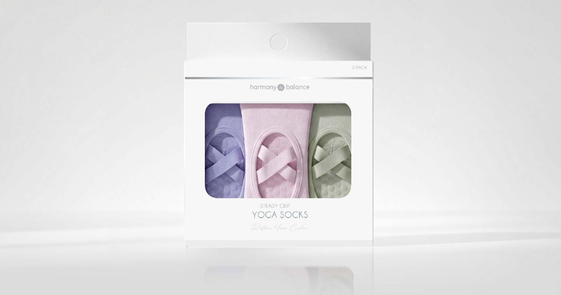
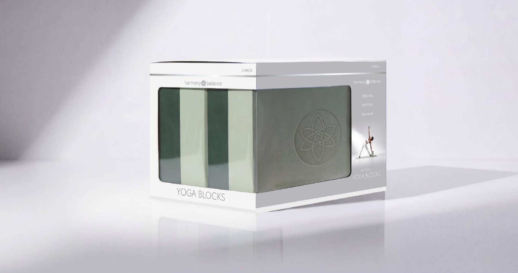
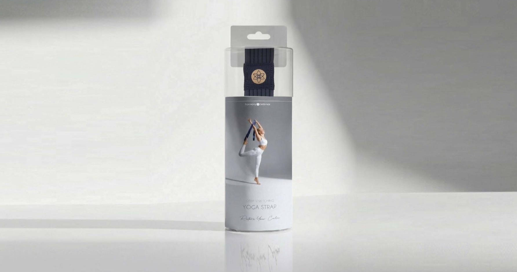
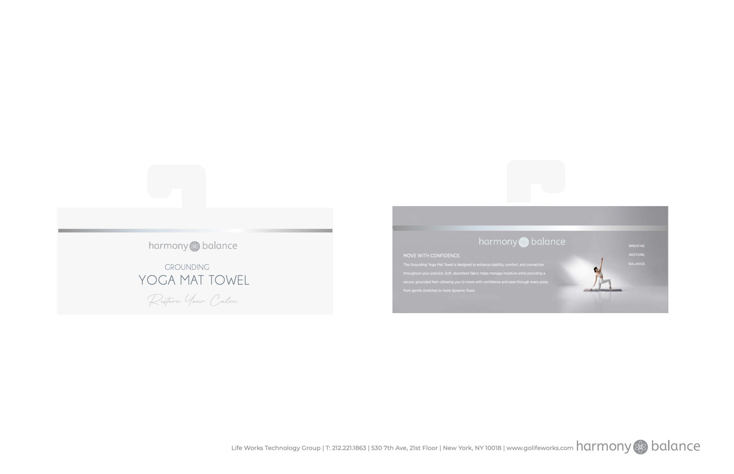
Calm on the surface. Rigor underneath.
I designed the packaging graphics, physical structures, production dielines, renderings, and presentation system across the range. Each format was resolved around the product’s weight, dimensions, protection needs, shopper interaction, and merchandising environment.
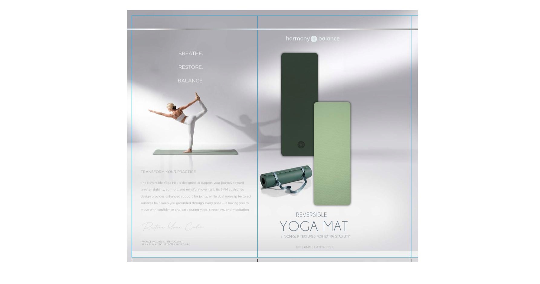
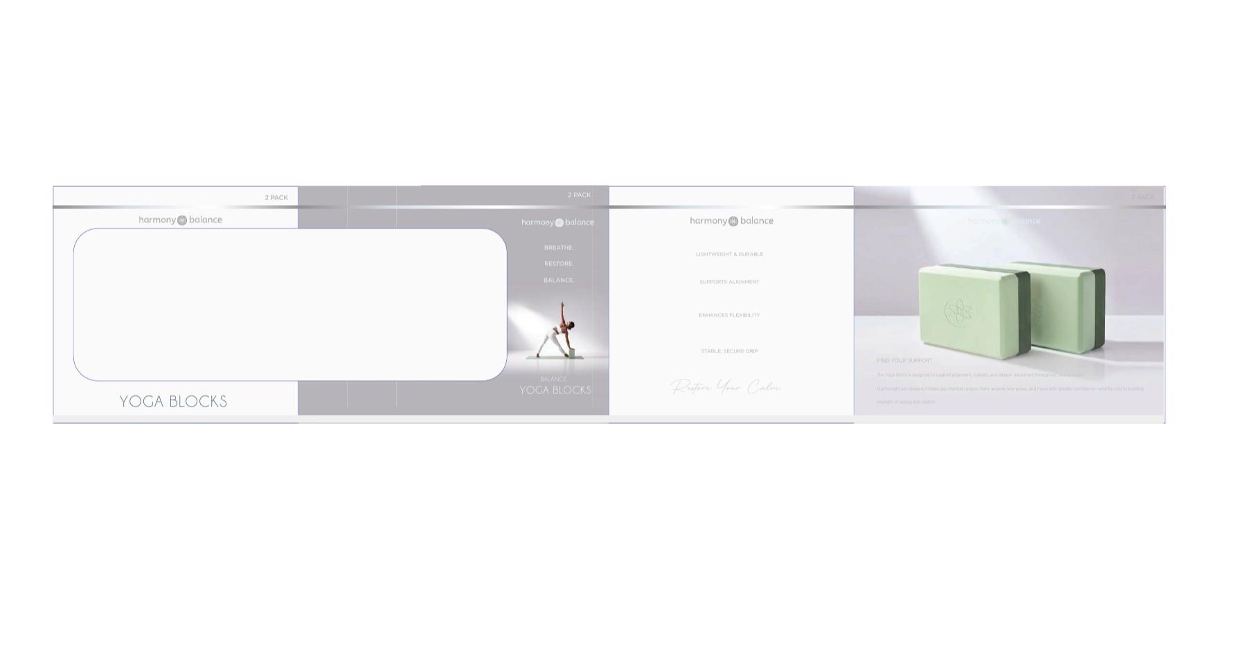
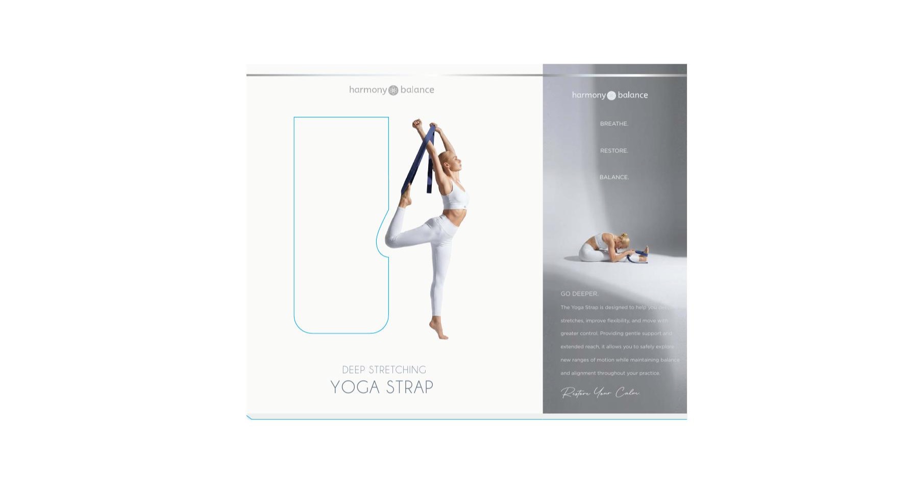
A recognizable shelf presence built through restraint.
The completed system differentiates Harmony & Balance through disciplined consistency rather than visual volume. Across wheels, mats, socks, blocks, straps, and towels, the product remains visible while the brand world stays calm, cohesive, and unmistakably intentional.
Adriana Soler created the packaging design, structures, production dielines, renderings, and creative direction. The Harmony & Balance logo was supplied. With physical samples unavailable and the deadline fixed, product and lifestyle imagery was developed using AI-assisted tools under Adriana’s art direction, with pose, lighting, environment, product interaction, color, and composition controlled for brand consistency.