Case Study 7 – WINX — Beauty-Led Automotive Packaging
WINX—Beauty-led design for the automotive aisle.
Reframing roadside essentials for women through product-first packaging, a refined metallic system, and the visual language of beauty and lifestyle brands.
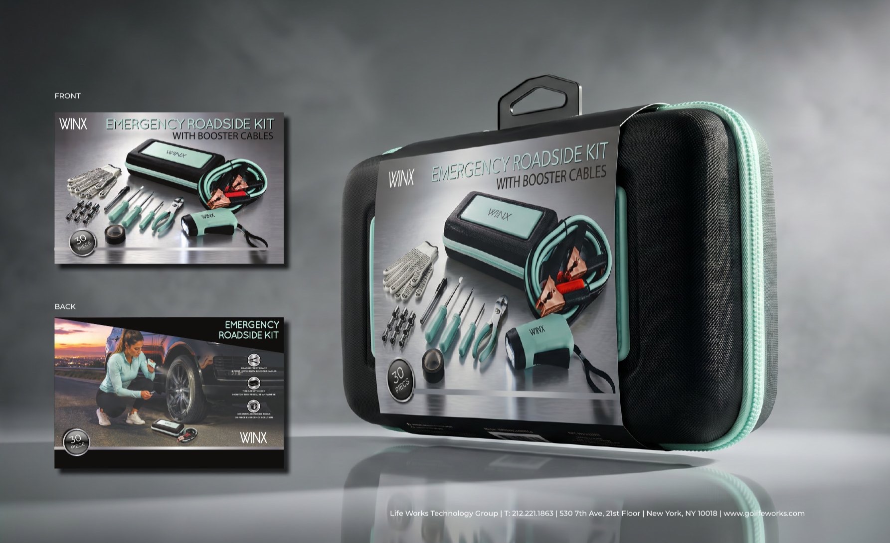
Safety without the category clichés.
Automotive accessories are often presented through a visual language that is technical, masculine, and crowded. WINX offered an opportunity to speak to women without reducing the idea to decoration alone.
The strategy was to combine the confidence and clarity required by a safety category with the restraint, polish, and product reverence associated with premium cosmetics. Function would remain immediately legible—but the experience would feel considered, personal, and desirable.
Make the product the hero. Let the packaging bring confidence, consistency, and quiet distinction.
A beauty sensibility, engineered for retail.
Product first
Large, unobstructed product views make function and value instantly understandable at shelf.
Material contrast
Brushed silver, matte black, and transparent blisters create a technical yet elevated foundation.
Soft color coding
Mint, powder blue, and blush organize variants while creating a recognizable family.
Consistent hierarchy
Restrained typography and repeatable iconography support quick comparison across products.
One system, multiple levels of need.
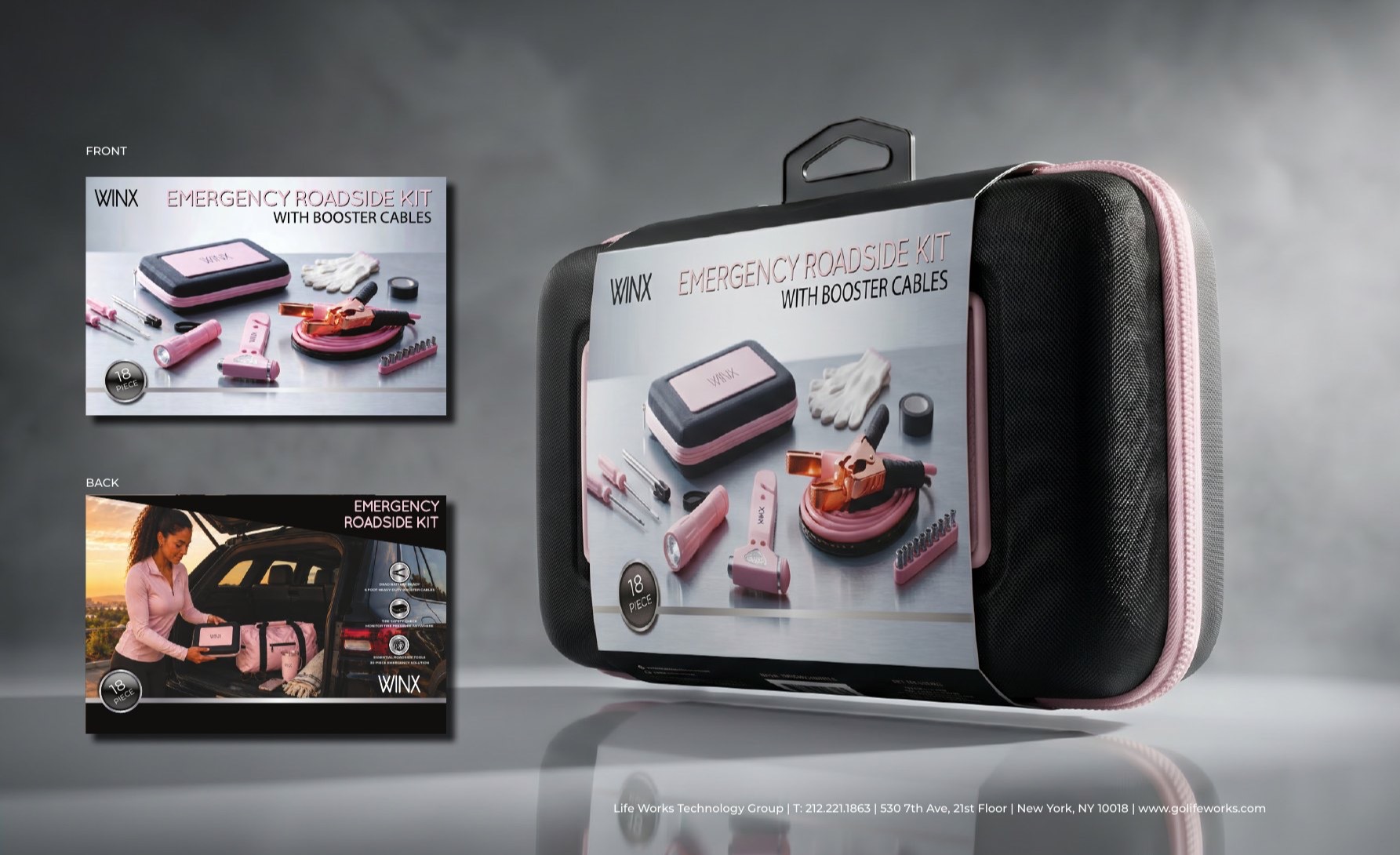
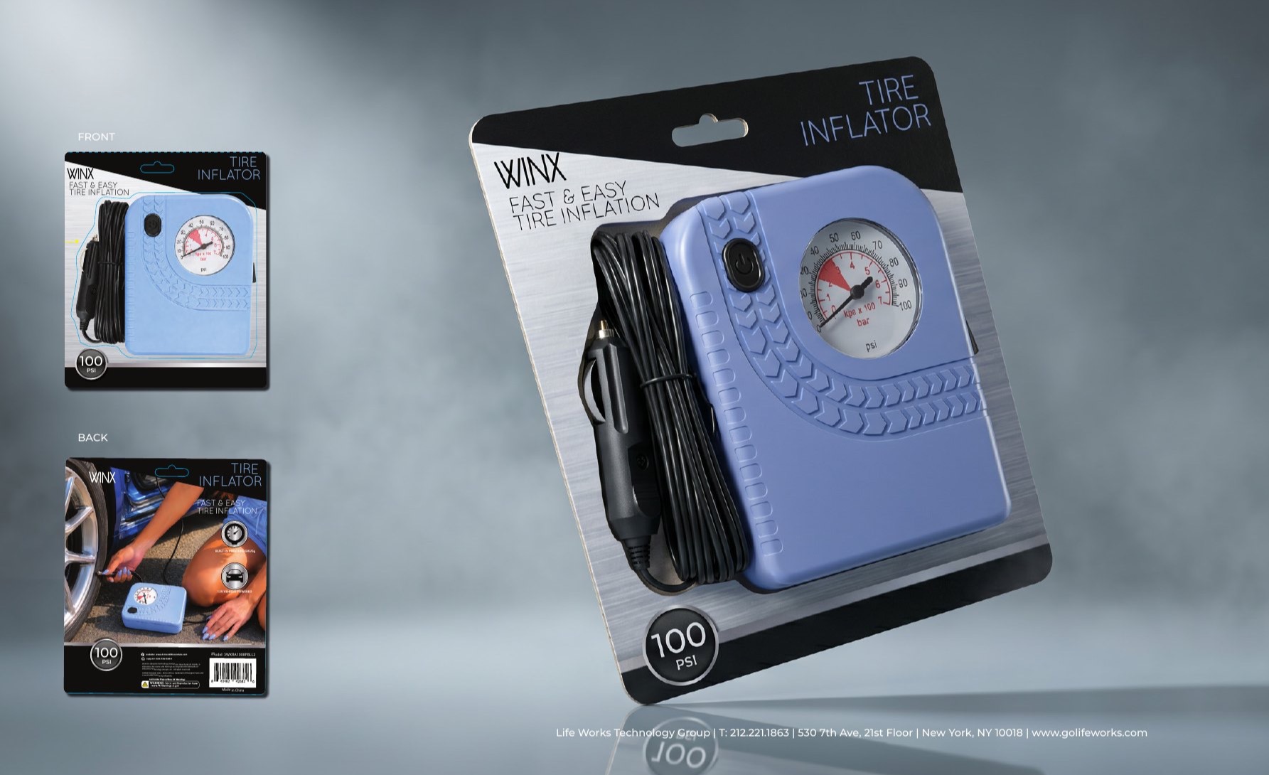
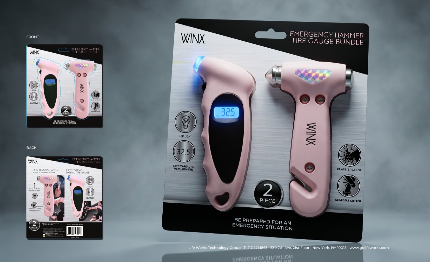
Designed as a real production system.
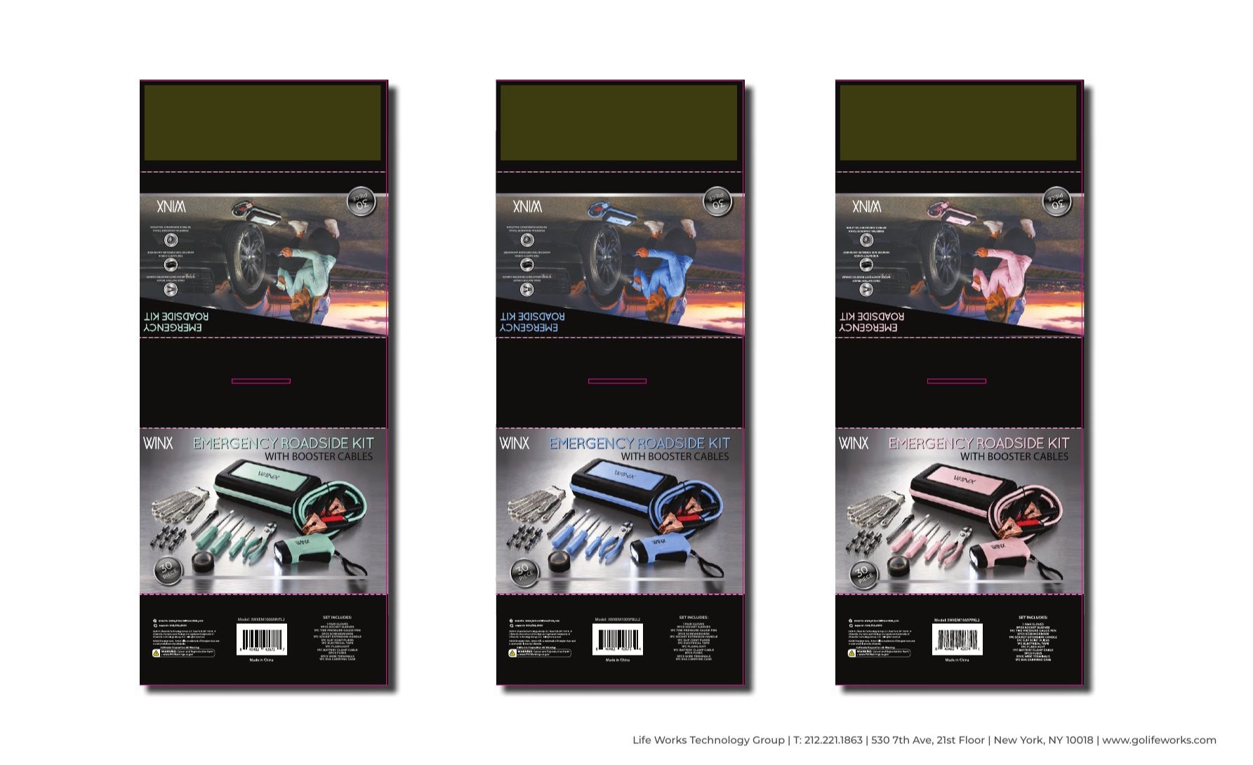
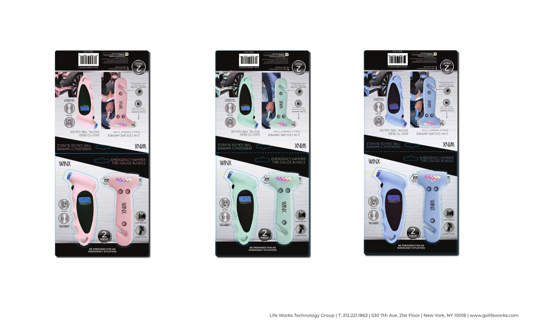
The work extended beyond presentation renderings. I created the packaging layouts and production dies, resolving front-and-back communication, hierarchy, barcodes, specifications, safety information, fold structure, and color variants across the range.
From utility to considered ownership.
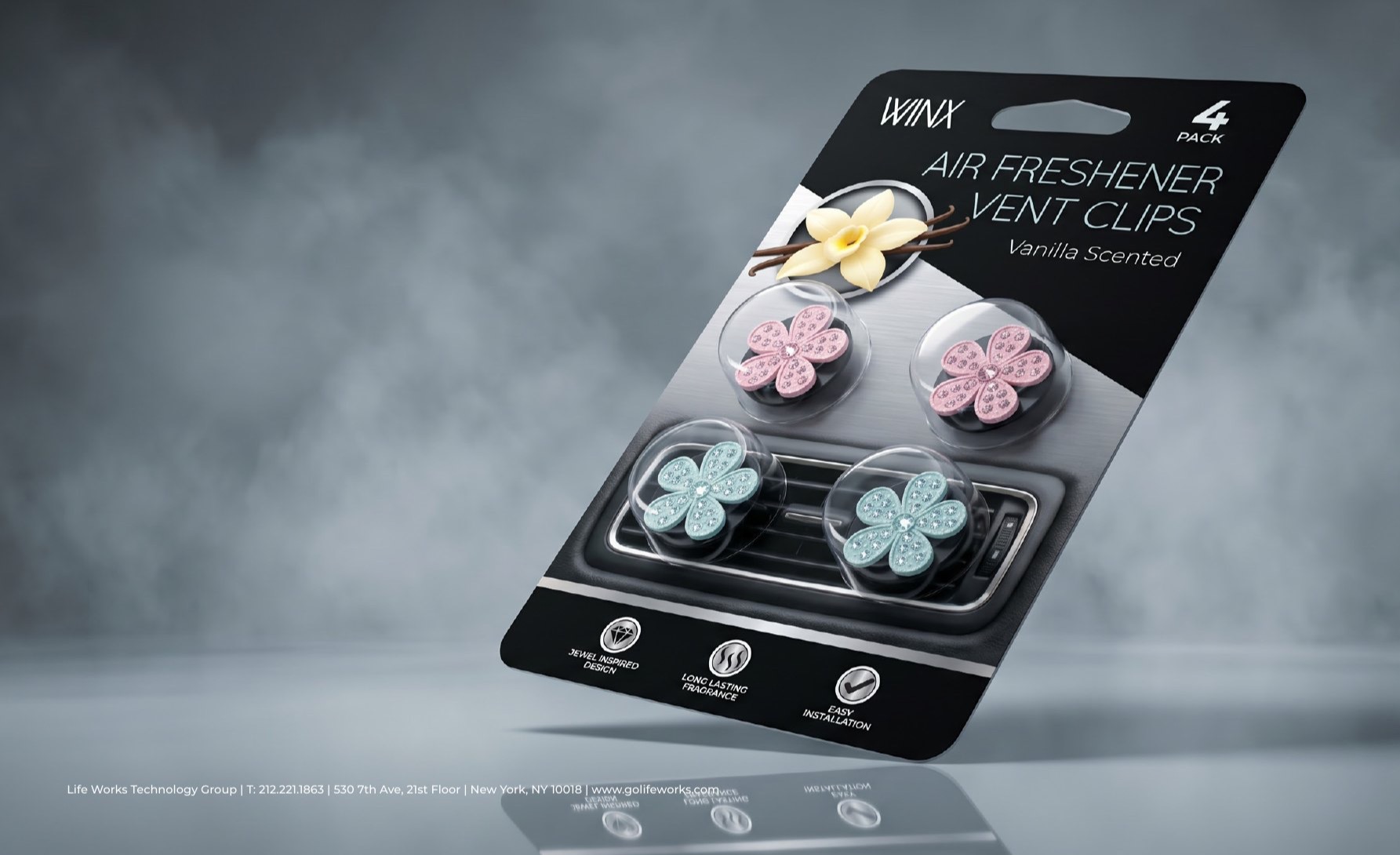
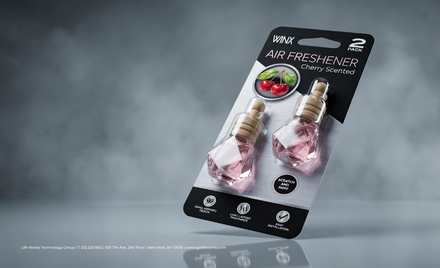
The fragrance collection made the positioning especially visible: automotive accessories presented with the polish, gifting cues, and sensorial appeal of a beauty counter. The same silver-and-black architecture kept these expressive products connected to the safety range.
A cohesive identity across safety, care, and lifestyle.
The completed system brings roadside kits, tire care, emergency tools, and fragrance products into one recognizable retail family—balancing technical credibility with a more refined and emotionally engaging experience.
Adriana Soler created the packaging system, product renderings, and production dies. The existing WINX logo was supplied. Lifestyle imagery was developed with AI-assisted tools under Adriana’s art direction to maintain brand, product, color, and audience consistency.